HTML Johnson Box
How to make your own HTML Johnson Boxes to add interesting effects to your web page or email template and encourage the reader to keep reading your message.
A Johnson Box is a HTML container with some styles such as color and borders added to it. The main obvious feature is a colored background which attracts the eye of the reader and encourages them to keep reading.
Johnson Boxes are reported to improve response rates in direct mail marketing and have been adopted for Online use by Internet marketers. Your own split testing will reveal what colors and border styles improve sales conversions the most.
Johnson Boxes can also be used for general blogging and article writing simply because they make a web page look more interesting. The Johnson box captures the eye of the reader and encourages them to keep scrolling and keep reading.
This page shows how to make Johnson Boxes using just HTML and CSS.
Johnson Box Types
- Johnson Box without a headline
- Johnson Box with a headline
- Johnson Box with an image
This post shows how to make HTML Johnson Boxes without a headline.
9 HTML Johnson Box Examples
Here's 9 HTML/CSS Johnson Box examples to play around with.
Simply copy/paste the CSS into your website StyleSheet. Change the Class Name my_class_name to whatever makes sense to you. For example, you might like to name the class of a yellow box box_highlight.
Example 1 - No Borders
Example 1 - No borders demo.
HTML
<p class="my_class_name">
	Example 1 - No borders demo.
</p>
CSS
.my_class_name {
	padding: 20px;
	background: #ffff99;
	width: 90%;
	margin: 40px auto;
}
Example 2 - No borders, shadow
Example 2 - No borders, shadow demo.
HTML
<p class="my_class_name">
	Example 2 - No borders, shadow demo.
</p>
CSS
.my_class_name {
	padding: 20px;
	background: #ffff99;
	width: 90%;
	margin: 40px auto;
	box-shadow: 0 8px 8px -6px #333;
}
Example 4 - 4 solid borders, shadow
Example 4 - 4 solid borders, shadow demo.
HTML
<p class="my_class_name">
	Example 4 - 4 solid borders, shadow demo.
</p>
CSS
.my_class_name {
	padding: 20px;
	background: #ffff99;
	width: 90%;
	margin: 40px auto;
	border: 1px solid #333;
	box-shadow: 0 9px 9px -5px #666;
}
Example 5 - 4 solid borders, rounded corners
Example 5 - 4 solid borders, rounded corners demo.
HTML
<p class="my_class_name">
	Example 5 - 4 solid borders, rounded corners demo.
</p>
CSS
.my_class_name {
padding: 20px;
background: #ffff99;
width: 90%;
margin: 40px auto;
border: 1px solid #e5e589;
border-radius: 9px;
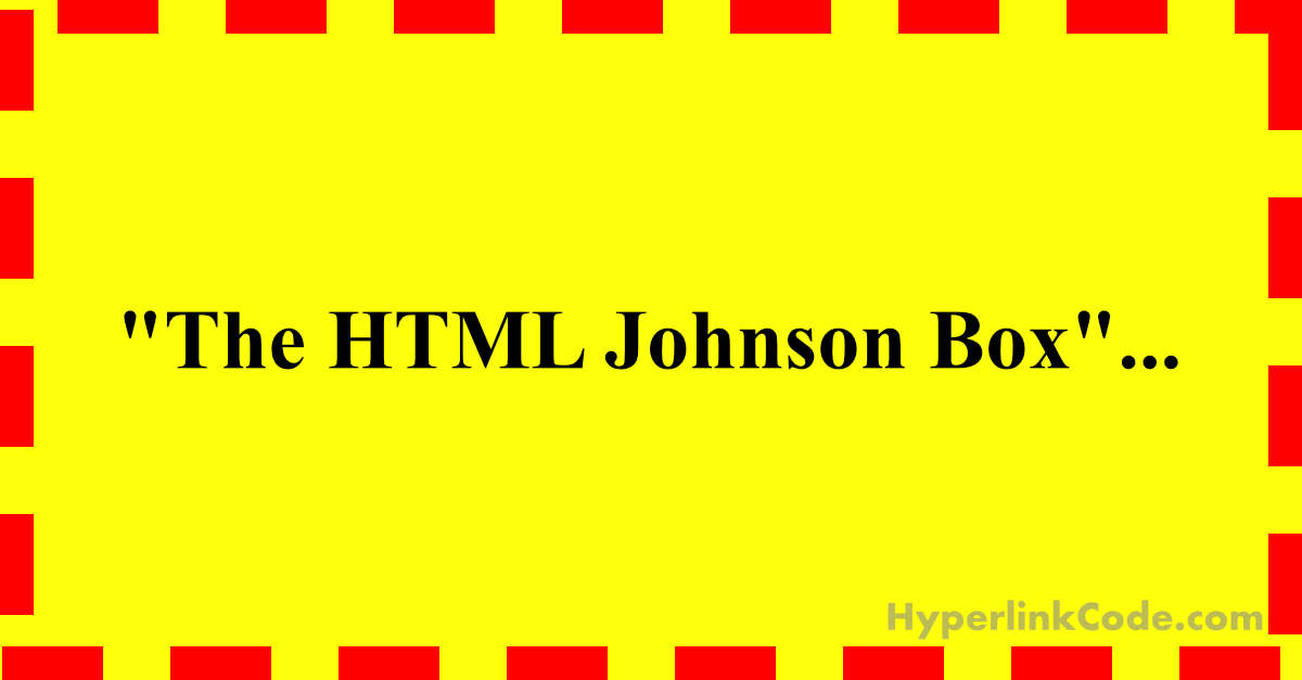
}Example 6 - 4 dashed borders
Example 6 - 4 dashed borders demo.
HTML
<p class="my_class_name">
	Example 6 - 4 dashed borders demo.
</p>
CSS
.my_class_name {
    font-weight: 700;
    text-align: center;
    padding: 30px;
    background: #ffff99;
    width: 90%;
    margin: 40px auto;
    border: 6px dashed #ee0000;
}
Example 7 - 2 solid borders
Example 7 - 2 solid borders demo.
HTML
<p class="my_class_name">
	Example 7 - 2 solid borders demo.
</p>
CSS
.my_class_name {
    color: #c90325;
    font-weight: 700;
    text-align: center;
    padding: 20px;
    background: #fee0e5;
    width: 90%;
    margin: 40px auto;
    border-top: 3px solid #fc1943;
    border-bottom: 3px solid #fd6581;
    }
Example 8 - 1 solid border
Example 8 - 1 solid border demo.
HTML
<p class="my_class_name">
	Example 8 - 1 solid border demo.
</p>
CSS
.my_class_name {
	padding: 20px;
	background: #ccffcc;
	width: 90%;
	margin: 40px auto;
	border-left: 6px solid #7fff7f;
}
Example 9 - 4 double borders
Example 9 - 4 double borders demo.
HTML
<p class="my_class_name">
	Example 9 - 4 double borders demo.
</p>
CSS
.my_class_name {
    padding: 20px;
    background: #fee0e5;
    width: 90%;
    margin: 40px auto;
    border: 6px double #fd6581;
}
Reference
Special thanks to the following websites for providing reference.